Product Design
Implementing a stellar user interface and user experience design is crucial to developing a successful product. According to recent statistics, 62% of people with a negative user experience on a brand’s website are unlikely to patronise the brand in the future, 48% of users are annoyed when they have a bad mobile experience, 80% of users won’t return if a site does not display correctly on their mobile devices while 70% of customers abandon purchases due to poor user experience.
This highlights the importance of designing beautiful, compelling navigational experiences for the end users of a website or online platform, to encourage them to come back again and again.
The benefit of this will provide infinite returns on investment, along with converting users into evangelists of your brand or online platforms without any effort. This is the power of a great UX design. In UX design, there are principles that serve as guidelines in ensuring a product fits the interests of target users and is simple to use.
These principles are based on the extensive research and experience of design experts like Donald Norman – Author of the design of everyday things and other fields of human behaviour, including Psychology and Sociology.
Below are the top ten most crucial principles to implement when building a great product:
1. User-centred
Keeping the UX design process user-centred is the foundation for a successful user experience. Your product is being developed to solve the user’s problem, but that can only be achieved if you know your users and understand their pain points, interests, and needs.
In designing an intuitive and user-centric interface for a product, you must understand your users before starting the actual design process, so the product can solve the users’ problems. Information obtained through comprehensive user research, user journey mapping, carrying out surveys and usability testing can be used to develop deep empathy for the users. This, in turn, helps you align your UX design decisions with user expectations, resulting in higher satisfaction, product adoption and user retention.
2. Simplicity
UI designs must be clean, easy to use, and intuitive. These attributes drive adoption by users and improve user experience. When a product’s user interface is complex for users to navigate, it increases their cognitive load and hinders decision-making.
Interestingly, this principle is supported by Hick’s law which says, “The time it takes to make a decision increases with the number and complexity of choices.” Simplicity must be applied in design by breaking down lengthy instructions for users into smaller tasks. In E-commerce, this may include things such as simplifying the checkout process, login, and sign-up pages, amongst others. Additionally, using clear and concise language in UX content, avoiding superfluous elements and giving limited, well-thought out choices, can help to contribute to a smooth user experience.
Simplicity helps you streamline users’ decision-making process when interacting with the product. This also prevents users from feeling overwhelmed and ensures they have a smooth and satisfying experience with the product.
3. Hierarchy
Hierarchy is one of the principles you must use when designing product user interfaces. Using this principle guides users when they are navigating the interface. It helps you organise and prioritise content in a way that establishes the order of their importance so users can quickly identify essential information first.
Hierarchy has two main components: Visual Hierarchy and Information Architecture:
- Visual hierarchy is about how elements are visibly organised in specific sections on the interface. Those elements, such as buttons, texts, and icons, are influenced by typography, colour, layout, and size. To make a button or a call-to-action easily discoverable, a designer must use bold typography, make it large, use a distinct colour, and add ample whitespace around it. This makes it pop, and users can focus on it without other visual distractions.
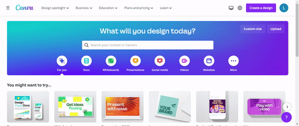
- Information architecture, This is the arrangement of content across the website or application. This helps users seamlessly navigate from one page or section to another without feeling confused. As shown below, Canva has a good example of a top-level menu bar which shows business, education and other options:
Also, in top-level menu bars, options such as home, about, pricing, and contact can be included just like what we have on our website, as shown below. These options could have other sub-menus or drop-downs that give users a clear path.
Implementing hierarchy in UX design empowers users to effortlessly navigate interfaces. Strategic organisation of content ensures easy access to vital information. Visual scale and well-designed information architecture create intuitive user experiences, promoting smooth interactions and a positive impression.
4. Accessibility
Accessibility in design is a mindset every designer and company owner must have. Making a design accessible ensures a product is usable by a range of handicapped target users.
This principle requires products to be effectively assessed and interacted with by individuals with a range of useability levels and removes any barriers that could impede certain users from a complete product experience. By enhancing product accessibility, the potential for revenue growth expands as it enables a more extensive user base and broader market reach.
Accessibility goes beyond catering to people with disabilities and extends benefits to users in different scenarios. For example, transcripts for audio content could be provided for the deaf, but it could also be beneficial to someone who just wants to skim the audio content or is somewhere they can’t listen to it.
Some ways of implementing this principle include setting contrasting colours on the foreground and background, using typography that’s easy to read, and applying descriptive alt text for images. The W3C Web accessibility initiative has a set of standards that could direct designers on how to use accessibility in their process.
Embracing accessibility in UX design demonstrates a commitment to inclusivity. By designing products for diverse abilities, businesses are able to enhance usability whilst opening new opportunities. By doing this, a larger market share is obtained. Accessibility fosters positive experiences and equal access and drives success. Prioritising accessibility ensures usability for all, increasing engagement and satisfaction.

5. User Control
User control gives users some control in their interactions with your product. It recognizes that users need to be able to make their own choices and determine their journey within the user interface. This empowers users and enhances their overall experience.
Jakob Nielson, one of the founding fathers of UX Design who co-founded the Nielson Norman Group, explained that users often perform actions by mistake. Hence, they need a clearly marked “emergency exit” to leave the unwanted activity without going through an extended process.
It is worth noting that users shouldn’t be compelled to take certain actions or be limited by specific settings. They should be able to recover from errors or change their minds without disrupting the entire user experience. Having “undo,” “redo,” and “cancel” features gives the user freedom to explore without fearing any consequences.
With better user control, business owners can prioritise user autonomy and create an environment that fosters trust and exploration. By enabling users to shape their journeys within the interface, businesses can forge a stronger connection with their target audience and establish a positive reputation in the market.
6. Consistency
Jakob Nielson summarises this principle with a quote:
“Users spend most of their time on other sites. This means that users prefer your site to work the same way as all the other sites they already know.”
Most users unconsciously have some expectation of how your site or app should work based on their experiences with other digital products. For instance, it is common to find the chat button floating at the bottom right or left of a website.
With this concept in mind, you don’t want to reinvent the wheel by coming up with something different from established design conventions, unless it enhances user experiences. Like other principles, this goes back to making the whole design process user-centric.
7. Usability
Usability is a measure of how easily your users can use your product. Undoubtedly, we live in times where people need more tolerance for digital products that aren’t as user-friendly, even if the product can solve their problem. Users will only use the product when it can solve their problem and can be used with ease. When this doesn’t happen, users are trained to quickly move onto the next thing due to the amount of choice available to them on the market.
Remember that usability focuses on creating a positive user experience through several essential elements. These aspects are discussed below:
- First, a user-friendly design should feel intuitive and make it easy for users to navigate and interact with the interface. This is related to consistency as users interact with the interface based on their previous experiences with similar products.
- Efficiency is crucial, ensuring that users can complete tasks quickly and effortlessly.
- A unique design helps users remember how to use the product, even after a break.
- User satisfaction is vital, achieved by incorporating visually appealing designs and providing smooth interactions.
- Lastly, the design should be forgiving of mistakes, offering clear feedback and easy recovery options.
Designing with these elements creates a user-friendly experience that not only meets the needs of users, but exceeds them too. These are fundamentals that must be applied in any business for success in constructing online platforms.
8. Context
As a UX design principle, context plays a vital role in creating meaningful and relevant user experiences. It involves understanding and leveraging the specific circumstances, environment, and user goals to tailor the design accordingly. Context considers various factors, including but not limited to their age, location, and language, whether they’re at a desk at home, in the office using a desktop, or on the go using their mobile.
For example, a ride hailing app might show users a map indicating different places and their location and expected arrival area based on GPS coordinates. Or when creating an app specifically for children, designers should use UX copy with simple language, bright, attractive colours and include parental control options. By providing users with quick, relevant information and options, context can improve the user experience by reducing confusion, frustration, and wasted time.
9. Personality
Personality is a crucial UX design principle that adds depth and character to digital experiences. It helps establish emotional connections with users, differentiate products or brands and maintains brand consistency. An example of personality in action can be seen in Slack.

Slack communication platform
For instance, Slack, a workplace communication tool, uses playful language, witty error messages, and quirky illustrations to inject personality into its interface, fostering a sense of enjoyment and trust. Infusing design elements with personality empowers UX professionals to create interfaces that captivate users, foster meaningful connections and strengthen user-brand relationships. Moreover, it helps products stand out, differentiating them in competitive markets and attracting loyal users. Brand consistency in maintaining a personality across multiple touchpoints helps to establish long-term relationships, builds trust and loyalty.
10. Feedback
Feedback involves giving immediate responses to user actions on the product interface. It helps users understand the outcome of their actions, letting them know if they’re doing the right thing.
It could come in various forms, such as confirmation messages or checkmark icons that indicate successful actions, error messages or warnings alert users to correct issues, a progress bar that reassures users during the checkout process, or a sound effect when a button is clicked.
Users need reassurance that they’re on the right track to continue interacting with the product interface. With an effective feedback mechanism embedded in the design, users feel a sense of comfort and security using the product, leading to a pleasant user experience and customer satisfaction.
Conclusion
These ten UX design principles are essential for creating successful digital products. If employed, this will make a visible impact on your business over time in revenue, user conversions and customer trust. Our world-class design team at Studio 14 applies these principles on a daily basis for delivering successful client projects.
Need help with connecting more effectively with your users, improving conversions or improving the user experience of your website or online platforms? Send an email to daniel@studio14online.co.uk to begin your journey to building something extraordinary with us! Follow us on LinkedIn, Instagram, and Twitter for more tips.